ROC curve and Neyman Pearsom Criterion
Partly based on the ECE662 Spring 2014 lecture material of Prof. Mireille Boutin.
Contents
1. Outline of the slecture
Receiver Operating Characteristic (ROC) curve is often used as an important tool to visualize the performance of a binary classifier. The use of ROC curves can be originated from signal detection theory that developed during World War II for radar analysis [2]. What will be covered in the slecture is listed as:
- Basics in measuring binary classification
- A quick example about ROC in binary classification
- Some statistics behind ROC curves
- Neyman-Pearson Criterion
2. Introduction
A ROC curve shows graphically about the trade-off between the true positive rate (TPR) and the false positive rate (FPR). Now assume that we have a two-class prediction problem (binary classification), in which the outcomes are labeled either as class 1 (C1) or class 2 (C2). There are four possible outcomes from a binary classifier. If the outcome from a prediction is C1 and the actual value is also C1, then it is called a true positive (TP); however if the actual value is C2 then it is said to be a false positive (FP). Conversely, a true negative (TN) has occurred when both the prediction outcome and the actual value are C2, and false negative (FN) is when the prediction outcome is C2 while the actual value is C1. Usually, the outcomes can be summarized into a contingency table or a Confusion Matrix:
| Actual class \ Predicted class | C1 | C2 | |
| C1 | True Positives (TP) | False Negatives (FN) | P |
| C2 | False Positives (FP) | True Negatives (TN) | N |
| P' | N' | All |
Each element in the matrix gives the frequency of a outcome. In the signal detection theory, each outcome has a different term. True positive is also known as a hit, while false positive has another name of a false alarm. True negative and false negative are also known as a correct rejection and a miss respectively. We can further define important measurement true positive rate (TPR, also known as Sensitivity) as TPR = TP/P = TP/(TP+FN), false positive rate (FPR, also known as Fall-out) as FPR = FP/N = FP/(FP+TN).
A ROC curve shows the relationship of TPR over TPR in a x-y plot, which depicts trade-offs between true positive (benefits) and false positive (costs). Any increase in TPR might occur at the cost of an increase in FPR. The area uner the ROC curve is a measure of the accuracy of the classifier. The best possible prediction method would yield a point in the upper left corner or coordinate (0,1) of the ROC space, representing 100% sensitivity (no false negatives) and 100% specificity (no false positives). The (0,1) point is also called a perfect classification. A completely random guess would give a point along a diagonal line (the so-called line of no-discrimination) from the left bottom to the top right corners (regardless of the positive and negative base rates). An intuitive example of random guessing is a decision by flipping coins (heads or tails). As the size of the sample increases, a random classifier's ROC point migrates towards (0.5,0.5).
3. A quick example about ROC in binary classification
Here we go over a simple example to plot an ROC curve. We assume that our classifier is able to return a probability of the predicted class for each test record (classifiers based on Bayes Rules can definitely do that). Then we can sort the records by the probability in a decreasing order so that those more likely belong to C1 come earlier in a list of all records. We can vary a threshold value t, so that records whose probability is greater or equal to t are classified to C1, while other records are considered to belong to C2. With each possible value t in [0, 1], we can compute TPR and FPR, in order to have an ROC curve.
The table below shows a list of records ordered by predicted probability. Column 1 gives the record ID, while Column 2 and 3 are the label of class and probability value respectively. There are 3 records in class C1 and 3 in C2, so that P = 3 and N = 3. Column 4 - 7 gives the records counts with the threshold value t set to the probability of current record. Accordingly, TPR and FPR can be computed in Column 8 and 9:
| ID | Class | Prob. | TP | FP | TN | FN | TPR | FPR |
| 1 | C1 | 0.80 | 1 | 0 | 3 | 2 | 0.33 | 0 |
| 2 | C2 | 0.75 | 1 | 1 | 2 | 2 | 0.33 | 0.33 |
| 3 | C1 | 0.55 | 2 | 1 | 2 | 1 | 0.67 | 0.33 |
| 4 | C2 | 0.50 | 2 | 2 | 1 | 1 | 0.67 | 0.67 |
| 5 | C1 | 0.40 | 3 | 2 | 1 | 0 | 1.0 | 0.67 |
| 6 | C2 | 0.30 | 3 | 3 | 0 | 0 | 1.0 | 1.0 |
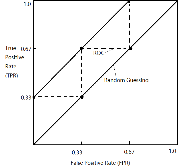
With some key points obtained by the table above, the ROC curve is the jagged dashed line shown in the figure below:

By measuring the area under the curve, we can tell the accuracy of a classifier. A random guess is just the line y = x with an area of 0.5. A perfect model will have a area of 1.0.
4. Some Statistics behind the ROC
In the statistic theory of hypothesis testing, a binary classification problem can also be stated as a binary hypothesis testing (if we assume a simple hypothesis):
$ H_0: \theta \in \Theta_0, s.t. x ~ f_0(x), H_a: \theta \in \Theta_1 s.t. x ~ f_1(x) $
And we use a binary decision rule d(x) as a function:
$ d(x) = \begin{cases} 0, decide\ H_0, x \in Region R \\ 1, decide\ H_a, x \in Region R^c \end{cases} $
This means that if x is in the region R, the function d(x) = 0 and we accept Ho; if x falls out of region R, the function d(x) = 1 and we accept Ha. In Bayesian Rule, the priors probabilities of each hypothesis are assumed known, and approach to hypothesis testing is represented by the minimum Bayes risk criterion. In some cases, however, it may not be possible to have a prior to a hypothesis, and we need other decision rules like Neyman-Pearson criterion.
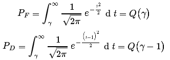
Recall that the FPR PF, also known as false alarm rate (probability) or size, is the probability of d(x) = 1 (x falls out of R and Ha is accepted) but actually Ho is in effect. TPR PD, also known as hit rate or detection rate or power, is the probability of d(x) = 1 when Ha is indeed in effect. So we have:
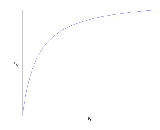
An ROC curve is a plot of PD versus PF. Usually multiple (PD,PF) pairs are obtained by adjusting the region of R. As R grows, both PD and PF decrease and approach 0; and as R shrinks, both probabilities increase and approach to 1. Here is an example in the Gaussian case:
Example
Given the simple binary hypothesis test:
$ H_0: p(x)\ \sim N(0,1), H_a: p(x)\ \sim N(1,1) $
If we separate the decision region with a threshold $ \gamma \in \mathbb{R} $: if in the region of x < γ, we decide Ho, otherwise Ha is accepted. Then we can compute the false alarm and detection probabilities as:

where Q-function is the right-tail probabilities for the Gaussian random variables. So the probability PD and PF can be illustrated as the following figure:

By moving the threshold $ \gamma $ from right to left (decreasingly), we will get an ROC curve of the Gaussian case as following:

Reference
[1] Mireille Boutin, "ECE662: Statistical Pattern Recognition and Decision Making Processes," Purdue University, Spring 2014.
[2] Jiawei Han. 2005. Data Mining: Concepts and Techniques. Morgan Kaufmann Publishers Inc., San Francisco, CA, USA.
[3] Richard O. Duda, Peter E. Hart, and David G. Stork. 2000. Pattern Classification. Wiley-Interscience.
[4] Detection Theory. http://www.ece.iastate.edu/~namrata/EE527_Spring08/l5c_2.pdf.
[5] The Neyman-Pearson Criterion. http://cnx.org/content/m11548/1.2/.
Questions and comments
If you have any questions, comments, etc. please post them on this page.
Categories: ECE662 | Bayes' Theorem |Probability | Bayes' Rule | Bayes' Classifier | Slecture | ECE662Spring2014Boutin | ECE | Pattern recognition

